-

awesome, wish i had one to keep my neon yellow mumbos in-just completes the set......update, got one now and boy does it look cool :)
-
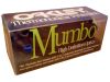
I really like the old school clear boxes that were used for these and the Frogskins. The white lettering on the clear box give it such a clean look. I also liked being able to see the contents inside without having to open the box. The only downside to this design was the fact that the box was not that durable and would bend or even rip rather easily.
-
The Mumbo box is probably the single most important piece of packaging in Oakley's history. There is nothing special about the physical box, as it is consistent with the ones produced over the previous five year. However the naming designated on the front provides proof of the contents within. A pair from 1990 onward will simply be an M Frame. While nice in their own right, the Mumbo was the original piece that redefined sports eyewear, and possession of the box is the only way to assure that the glasses are among the few created before the name was changed.
-
The Mumbo box is iconic as it represents Oakley's yesteryear of clear acrylic packaging, bringing back nostalgic memories of neon frames and multiple lens hues. For some patent/legal reasons Oakley changed the name of the Mumbos to "M Frames" not long after their release, so if you've acquired one of these boxes, hang onto it!
-
I Love this style of box more that the others combined. It almost looks like (to me) that your buying "high end" bike parts or car parts with its see though and frosted sections.


 Glasses
 Goggles
 Watches
 Alphabetical
 Video Reviews