Oakley has cycled through many logos over the years. The Icon is the most recognizable, but many textual forms have also been popular.
Early Logos
Before the company settled on a standard logo, several were used at different times. The first logo featuring the acorn was used on Jim Jannard's business card in 1975. The MX logo was used on the first invoices.
When the Grips were released, the acorn logo remained in a less characterized form. The grips only retained the 'tire' O, but the entire logo was used in some branding.
Thermonuclear Logo
In the early 80's, the Thermonuclear Logo (or Classic logo as it's known now) replaced the original logo on the Grip and Grip II's, and also appeared on the goggles and [Factory Pilot Eyeshade | Eye Shade's]. The product logo simply used the stylized text, while boxes and other branding used the term Thermonuclear Protection, in reference to the Sun being the largest nuclear oven and the ultimate threat to our eyes. The Thermonuclear Logo lasted roughly 10 years and was last used on the
M Frame and
Sub Zero. The re-released of the [New RazorBlade | RazorBlade] also retained this logo, but it was the purpose of tribute rather than an attempt to reuse the logo.
 Stretch Logo
Thin Stretch
Stretch Logo
Thin Stretch

In 1993, after the Thermonuclear Logo was retired, the Stretch logo appeared on the latter releases of Sub Zero's including the #n variants, as well as early
Zero's. M Frames skipped this step and jumped directly to the Icon. The Icon appeared only a year later and most new released also used that, but the Zero line did not until their final year of production in 1997.
There were two variations of the Stretch logo, an earlier which had a boxy 'O' and another with an elliptical 'O'. However due to apparent inventory and shipping inconsistencies, the combination and release times of these two logos were not always matched between the nose bridge and earstems (if a logo existed at all on the nosebridge). Since the elliptical logo remained the longest and continued on to other products, it is assumed the boxy logo was the original. This form of the logo remained on glasses from 1993 to 1996 at which point the Icon took priority. It was still used on branding until it was replaced by the Heavy Stretch logo.
Heavy Stretch Logo
In 2004 with the release of the
Stretchline models, the original 'thin' stretch logo was thickened and re-branded as the Heavy Stretch logo. This appeared on the ear stems of the Stretchline models (excluding single colorways from the main line) and on other branding pieces such as boxes and the new dark display towers. The logo was also combined with others into the 'graphic logo' where the text would be arranged in many directions to form a background.

In early 2006 the Heavy Stretch logo was combined with some graphical elements to create a swirl pattern. This was mainly used on PointOfPurchase displays for the purpose of branding.
Icon
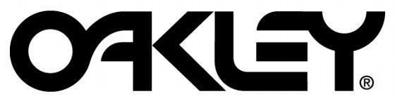
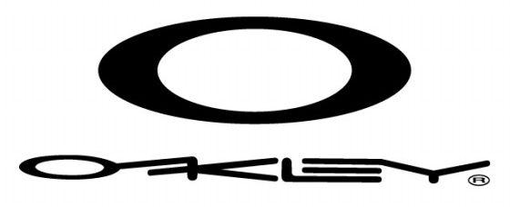
The Icon is the logo used for most of Oakley's brand recognition since 1994. The logo has been used on most glasses and has existed in many variations.
Standard Icon
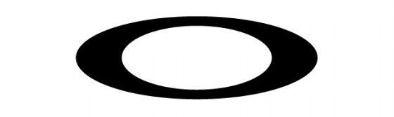
The plain icon is an ellipse within an ellipse. It can be made with two concentric circles and then stretching both horizontally. First appearing in 1994 on the Eye Jacket, later Jacket releases used this on their ear stems. The M Frame also switched at this time, however, the Sub Zero and then Zero, which had started using the Stretch logo, continued to do so until 1997. For all frames up until 1999, the icon was molded directly into the frame, and then painted. Once the ProductLineRenewal occurred in '99-'00, all icons switched to metal shells over a plastic decal, presumably to deter counterfeits. This Icon continues to present day.
For the purpose of box or other display branding, the current logo and text are often combined. Primarily, the Icon was used with varying forms of the textual logo.
Thumbprint Icon
The Thumbprint Icon is a solid Icon with rivet accents and some additional details. It has only been used on the Half Jacket, but otherwise primarily on branding. It was widely used on [Oakley Stores | OPD] signs around 2000.
Static Icon
The Static icon is used purely for sportsmarketing branding purposes, and has never been issued on a pair of glasses.
Script Logo

The Script logo was created in 2004 to coincide with the female specific colorways. Once entire models were created for females, the logo was altered slightly and leaned forward less. The original Script logo can be found inside an ellipse on certain models and colorways to denote that they are meant for women. Usually this ellipse is the same size of the standard Icon in order to avoid remolding the entire frame. The newer female specific models returned to using the standard Icon since there was no need to draw a distinction within the release. The etching on the lenses to specify Polarization, however, is drawn in a script style font rather then the standard barktwo font.
 Abstract Logo
In 2015, this abstract logo started appearing on Vault Apparel

 Glasses
 Goggles
 Watches
 Alphabetical
 Video Reviews