-

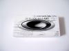
very nice looking box, the white makes it "fresh" to look at, as supposed to the yellow, which gave it a more "normal" look.
the printing looks great, with the 3d-ish icon on top
the only thing comfusing is the CROSS text, because when you are looking for a specific box, CROSSHAIR comes to mind, and you get a little "confused"by it.
-
The generic white box doesn't really have the same appeal as its predecessors, which illustrated the picture of the glasses they carried. From a business/economic standpoint, however, the box proves sufficent, and at least has a somewhat interesting graphic design.
-
Boring and not really Oakley. I miss the old black and white boxes with the photo of the model inside.
-
Very boring and plain especially when compared to the older boxes - I even prefer the yellow ones to these - but they are still cooler than most boxes you might get from any other company out there. If it wasn't for the black and white writing on it, I would have given it a lower score.
-
Compared to the yellow box it's much better, but my favorite is still the old black one.


 Glasses
 Goggles
 Watches
 Alphabetical
 Video Reviews