-

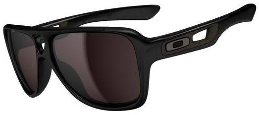
Frame: Matte Black
Lens: Fire Iridium
I originally was not really a fan of this frame, but I was surprised how good the coverage is. They are also a lot lighter in weight than they appear.
-
Frame: Navy blue
Lens: chrome
The navy frame with white and red accents, and chrome lenses, are really a sharp new color scheme. Also found on the Jupiter squared. The Dispatch II is a style that likely won't win a lot of hearts, but as a fan of the original Dispatch - I really enjoy the style and lines. The fit is very comfy. A pretty loose fit that doesn't give any odd pressure or resting points. The plastic aviator style isn't one common in Oakley line, so it is a nice addition to the collection.
-
Frame: Persimmon Fade
Lens: Fire Iridium
I wanted very badly to hate this Dispatch as much as I hate the original. Unfortunately, in the right colorway, these just seem to work. I've received nothing but compliments while wearing them. They fit very much like the originals, but seem to be a bit larger in the lenses. The icons change in the manner of the Batwolf. My only reservation is that they remind me of Smiths or Spys.


 Glasses
 Goggles
 Watches
 Alphabetical
 Video Reviews


