-

Those were the good old boxes with the black and white photos of the glasses. Those photos and also the Splice letters are an artwork itself. Shame that these days are over and we now have only those generic and boring boxes.
-
Fine Fine.
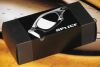
After acquiring 20 pair of Splice, I naturally ended up with quite a few Splice boxes, and even went as far as to ensure acquisition of each unique box. Aside from the JPM box, with its artwork, the classic styling of the B&W photography signifies a high point in Oakley's brand marketing. The products at this time were wild, but they played down the craziness with clean elegant representations of each model on a simple black background. With no direct lighting on the subject, reflections and highlights trace the contour of each piece and create a work of art on each box.
-
Gone are the days when Oakley boxes featured a distinct picture of the glasses they came with; today, in the name of "cutting costs", the boxes are "generic", having the same basic layout for almost all glasses. But once upon a time there was an incredibly innovative Oakley phenom known as "Splice", and that product came with a box. A black-and-white photograph adorned that box, and although there was no color, the point was clearly articulated: these glasses were something otherworldly. One look at the picture, with its agressive lines and surreal architecture, and the onlooker was more than convinced that the contents of that package were well worth the price...
Where's Dann's review on this???
Five skulls!


 Glasses
 Goggles
 Watches
 Alphabetical
 Video Reviews