-

Edit:it's about time the guys came with another kind of box,more attractive and closer to the sci-fi art of oakleys.
-
Unlike most people here that don't like the yellow generic boxes,I find them rather quite attractive.sure,the older ones with the pictures of the actual models were the best,but I think the yellow ones,with the the very sci-fi oakley icons on top,(by far the best oakley icon they have come up with),do create a pattern.The icon looks like a spaceship,or a weird hi-tech gadget,certainly being much in compliance with the whole notion of oakleys.It's sad that both these kind of boxes disappeared,and now we have these generic white boxes that are,and look as well very cheap.
-
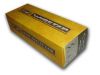
one of those rare yellow boxes that is custom printed with the actual model name written across. these days, Oakley just uses a generic yellow box with the O icon and the only way to differentiate what style of sunglasses are inside are the sticker at the end of the box.


 Glasses
 Goggles
 Watches
 Alphabetical
 Video Reviews