-

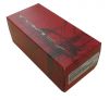
Pretty cool design. I think they used this for other types of frames. The red is definitely nice and stands out.
-
being red is a cool thing , having the STRETCH logo is double cool , so as with all stretchlogo cardboardboxes. very nice ;-)
-
This is such a nice change to have bright red boxes, which really distinguishes between the strethline models and the normal boring yellow boxes that they are using now.
-
Still partial to the elegant black and white boxes, but the stretchline Red boxes are very nice, and much better than the generic yellow ones that have been out recently. The scatter logos make a nice design around the box.
-
nice, red box. love the contrasting Oakley logo on the back background, and matches well with the red microbag that's holding the Wardens inside.


 Glasses
 Goggles
 Watches
 Alphabetical
 Video Reviews